
Extreme Weather: Heat
Branding, UI/UX, & Web Design
Heat is a website designed by the Digital Corps to promote an architecture class at Ball State. The class sends students to extreme climates to build temporary structures. They requested a website and blog to display the results of the project in a unique way. The professor wanted to use the website to promote the project to investors and potential students, and as a tool to talk about the project at conventions. I contributed to web design and identity design for this project. We also designed a blog for the class, to be used to promote the project, and in the future when the class goes to new environments. You can navigate to both websites using the buttons in the credits.
AWARDS:
ADDY's 2018: Student Best in Show
ADDY'S 2018: Student Gold Digital/Interactive Addy
AIGA Blue Ridge’s Annual Flux Student Design Competition: Honorable Mention Web/Interactive
Exhibited in Frederick, Maryland on 2/3/2018
PROJECT MANAGER: Leah Callahan
DESIGNERS: Sydney Patton, Grace Winiger, Anna Weddle, Emily Mixter, Ian Buchanan
DEVELOPERS: Brandon Groff, Michael Adair
VIDEO: Jacob Guenin, Dustin Grissom
COMM: Miller Kern
UX: Viveka Melo, Madeleine Jordan
Brand Identity

Identity Development
I worked directly on the identity design and branding for the project, working closely with the head designers to create an identity that communicated the oppressive heat of Death Valley.

Extreme Heat Site Screens
The website includes profiles of the students with the structures they designed, information on the climate of Death Valley, and an interactive game to test the individual structures.
This project was a unique one to work on because the client gave us complete freedom to create, in his words, an "untraditional" website. He specifically asked that we design multiple ways to navigate the site, keeping in mind that it is targeted both at technology adept professionals in the field such as architects, professors, and students, as well as relatives and friends of students on the trip who may be less familiar. To plan for our wide audience, we designed two ways to navigate the website that may appeal more to the different groups. I specifically designed both the mobile and desktop dropdown menu and worked with the other designers to create the interactive map navigation.
The landing page features two different ways of navigating the site, a more traditional dropdown menu, and an interactive topographical map with the different pages.


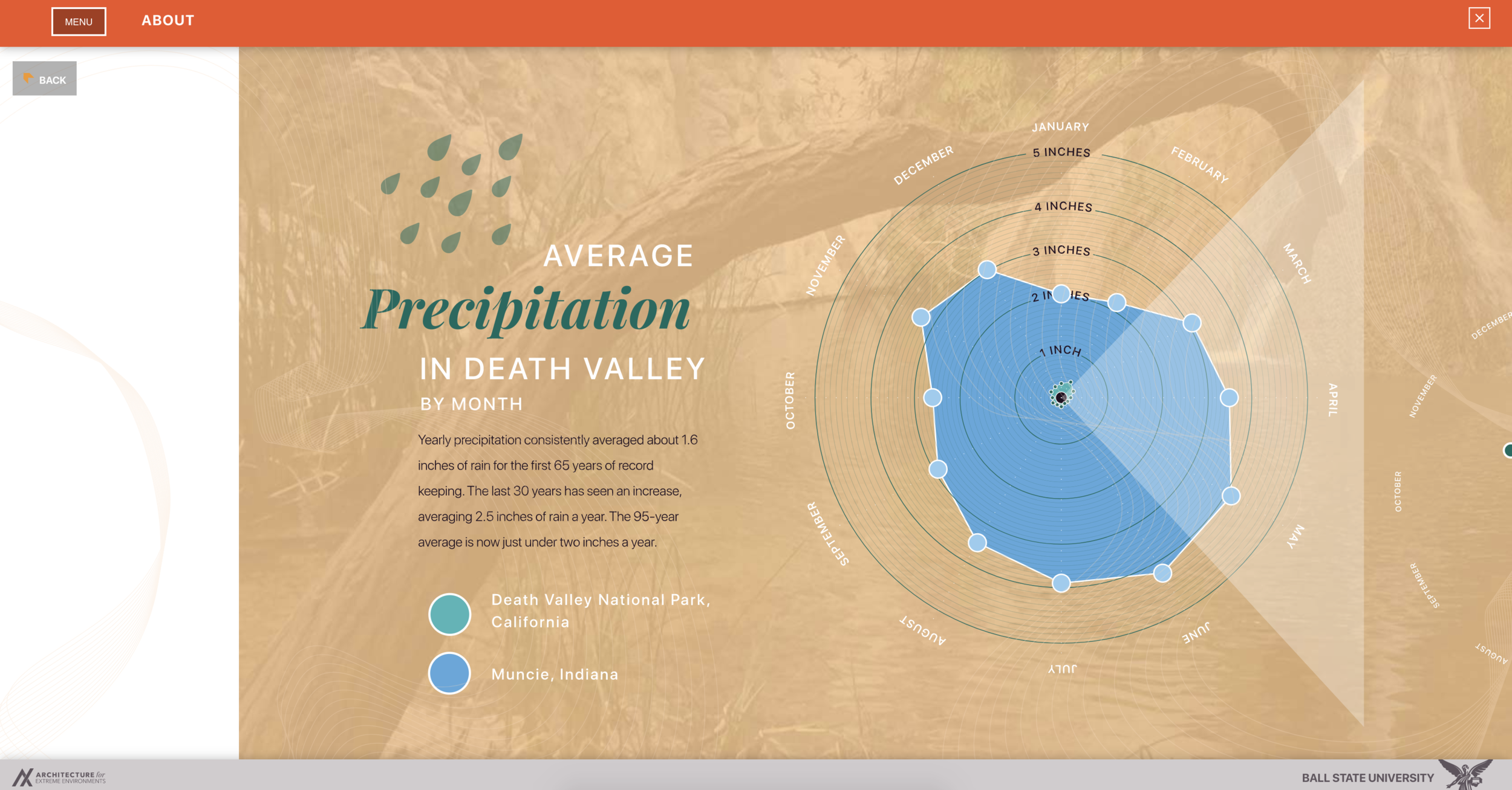
The about page has information on the climate, history, and native creatures of Death Valley.


The student profiles page introduced the architecture students involved on the project and talked about the structures they designed.

The field notes page covers their trip out west with a day by day record.

History of Death Valley displays before and after pictures to communicate how the area has changed.

The game allows the user to challenge the integrity of the structure against the various challenges of Death Valley.


The overview section summarizes the takeaways of students and faculty involved in the immersive class. It displays the user progress through the information with a thermometer gauge.


Mobile Website


